T.I.M.E stories expansion graphic workflow
At the end of last year, I made a fan time stories scenario. Concretely, only the “story” part was finished then, with all the graphics missing. This year, together with Michalina, I was working on and off on adding the custom images to the game. Being relatively new to graphic design, I tried a couple of different styles and workflows for creating the content.
Styles/workflows
First plans
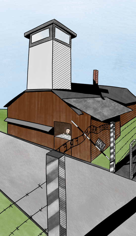
Initially, I planned to do a simple lineart drawing + flat colors to make it easy to create a lot of images. The first image I created used this technique and took around 8h to draw (+an hour or two for adding people on top).
Going fancy
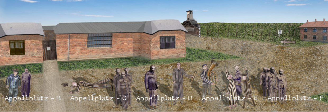
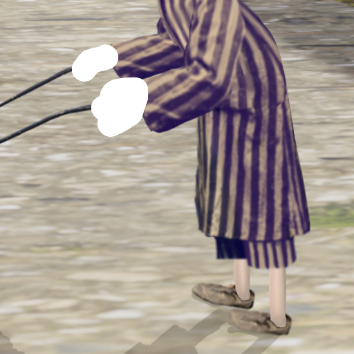
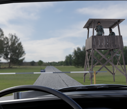
Then, I decided to see how close I could get to being photorealistic. I planned to make the first location (Appellplatz) through a collage of drawing, applying textures, and manipulating other images from the internet. I hoped to spend more time on this location to get it really nice and choose a final workflow for other pictures based on how long different parts of this process took and how much they contributed to the final look.
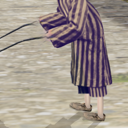
I ended up using many images from United State Holocaust Museum who have photos of concentration camp clothing available online, some textures from Poly Haven, and lots of photo manipulation in Procreate. Initially, I was planning to apply style transfer on top of the image to give it a more painterly look and hide the anatomy/perspective problems that I created (what ended up to be an overly optimistic goal).
Style transfer
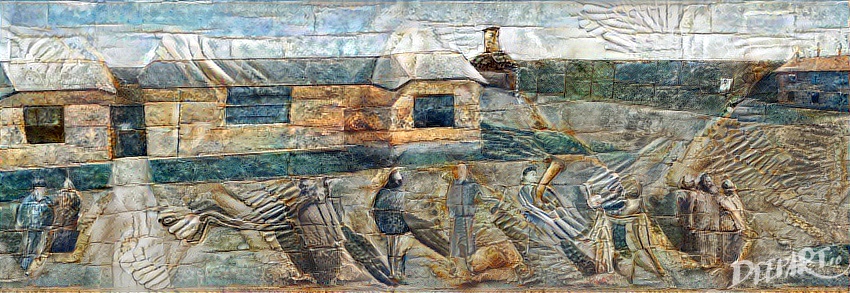
I played a bit with various methods for doing style transfer to fix the image that I created. As I didn’t want the stylization to spin into a 5-year research project,1 I looked only at the tools that are easy to use (in particular don’t require training a neural network).
Neural Style Transfer
The classic2 method for doing style transfer involves optimizing a (content) image using gradient descent to keep late activations of some CNN the same while changing the early ones to match the ones of another (style) image.
The results were not great: I tried deepart.io and Arbitrary Style Transfer in the Browser, but the style application was too strong (even on the lowest setting), making it too hard to read the details of the images.
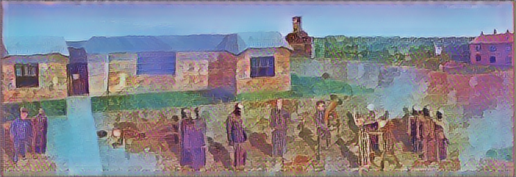
Another problem with them (and all the other browser-based tools that I tried) was that they support only small images, while I wanted to keep everything in high pixel density.
NVIDIA tools
NVIDIA has some of their research available interactively through the browser. I tried two tools that could be useful for style manipulation:
- GauGAN, where the user draws a rough segmentation map with different colors corresponding to different textures (eg. you can paint “trees” or “rock”), and the model generates an image based on this map and a reference landscape image. Low details, not the workflow I wanted, no people.
- Inpainting, where the user deletes parts of the image, and the model tries to fill the gaps. I tried deleting parts of the image with broken anatomy, but the inpainted results blended to the background more than fixing the details.
G’MIC
G’MIC is an extensive, open-source library for processing images. It is included in many popular graphics software (eg. GIMP, photoshop, Krita) as a plugin and also has an online version.
Among others, it has many filters available for postprocessing of the images. I tried a couple of them.
The G’MIC filters deliver on their promise: they change the style of the images, with some of them making them more painterly. At the same time, as they are hard-coded (not learned) they can’t focus on fixing the places where the geometry was wrong.
Style transfer results
The tools I tried couldn’t help me in my workflow: they weren’t able to fix what I did wrong when creating the images.
I believe that the necessary research for this to happen has already been done: it should be possible to take a loss \(L(x)\) describing “how likely a given image \(x\) comes from a dataset \(D\)” (taken from a GAN discriminator or a density estimation model) and update a given image using gradients \(\frac{\text{d}L}{\text{d}x}\).
A technique that is closest to this that I know of is DeepDream. It optimizes the features of the image to facilitate classifying it with one of the classes instead of “matching the dataset” though, which causes a trippy, overly-objectified effect.
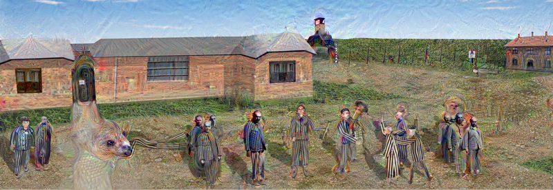
As I couldn’t find a successful style transfer tool, I went with the raw images in the end.
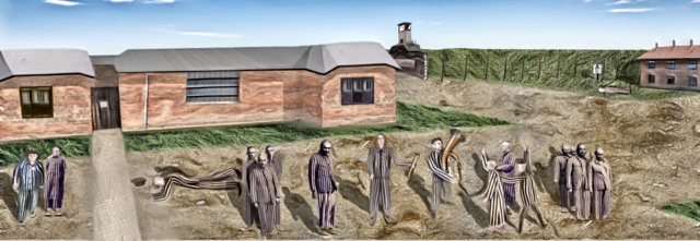
Going 3D
After spending way too long on the Appellplatz image despite the results not being great, I made a step back and looked for different options. I decided to try to use Blender (a 3D-modelling tool) to aid with the image creation. I would be modeling the backgrounds in Blender, rendering them, and then drawing the people on top of the renders.
After learning the basics of Blender3 with the donut tutorial, it was relatively quick to prepare models that are good enough.
The existence of a huge library of free (mostly CC attribution) 3D assets on sketchfab made modeling easier, but, most of the time, I was creating cubes and adding free textures (from PolyHaven again) on my own.
A great feature of the 3D workflow was that I didn’t need to fix the shot/perspective at the very beginning of a drawing. Instead, after the model was mostly done, I moved the camera/changed its focal length to put the characters in the correct part of the image.
While making the first barrack (and learning Blender) took some time, I could then make the next scene in only a couple of hours, which was a significant improvement over the hand-drawn/photo-manipulation workflows.
Graphics workflow
Apart from creating the graphics themselves, I needed a mechanism for adding them to the cards. Initially, I had each card available as an svg, which I manually exported to png via Inkscape’s UI. Then, I would use a script to order the cards and generate a pdf.
One problem with that workflow is that whenever one multi-card panorama changes, it is necessary to cut it into pieces again, add each of them to the corresponding Inkscape file (a.svg-h.svg), and then export them again.
What I ended up doing is, frankly, what I should have started with: keeping only a single svg file for a location and exporting it card by card using Inkscape’s command-line interface.
Export script
Here is a piece of the script that I ended up using:
# bash numbers tables starting from 0, but seq starts with 1
for i in `seq $((${#CARDS[@]} - 1))`; do
  inkscape --export-filename=${CARDS[i]}.png \
  --export-area=$(($WIDTH*($i-1))):0:$(($WIDTH*$i)):$HEIGHT \
  --export-dpi=60 full.svg
done
One problem with that was setting the correct $WIDTH: as my svg file unit was a millimeter, but the command-line interface uses “user unit” (which, as I learned later, corresponds to one pixel under 96dpi, independently of the chosen export-dpi), I eyeballed/binary searched the conversion rate.
Guides
Guides are the axis-aligned lines that help to arrange the objects on the canvas. In Inkscape, after double-clicking a guide, one can set its position (including the origin, which is a point on the line) numerically.
I used them to accurately scale the external panoramas pasted to the Inkscape files: I would have two guides, with origins set to the opposite corners of the page, and scale the image while snapping to the guide origin.
Arranging objects on the cards
Another issue with multi-card Inkscape files I encountered was centering a text/object on each card separately.
Inkscape has an “Align and Distribute” tool to do transformations like this, but you can only either:
- Center all objects wrt. page, object, or selection, or
- Distribute all objects equidistantly (in some sense) among themselves.
As it isn’t possible to express the centering I wanted directly, I had to get creative. What I ended up doing is:
- I created a thin line at both ends of the page. Guides helped with placing them precisely.
- I placed the objects to be centered on each card on separate cards (inaccurately)
- I added a thin line somewhere between each card.
- I selected all lines and objects and turned on “Distribute centers equidistantly horizontally”.
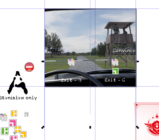
Note that using just the lines at the ends (to skip point 3 above) doesn’t work, as it would put the same distance between the end of the last text and the border of the page as between the texts themselves, where the latter one should be twice as big (as it covers space on two cards).
Flow text
There are two types of objects for storing text in Inkscape:
- regular text,
- flowed text.
Flowed text, apart from paths describing the letters, contains a blue “bounding box” with the area that the text should fit into. It is more convenient to work with, as you don’t need to change newlines every time you modify the text.
I found two ways of getting a flowed text in Inkscape:
- To select an area that will become the bounding box after choosing the text tool (as opposed to clicking on the canvas once, what creates regular text).
- To select a (regular) text object and then another object with shift, and choose Text > Flow into frame.
Initially, I thought I will be using the second option with semi-transparent text boxes to improve visibility, but the Flow into frame option doesn’t allow to set margins between the frame and the text.
I found a workaround for adding the margins, involving creating another invisible box inside, but I found the first option with manually specifying the bounding box easier to use.
Simple card generation
There are many similar cards in a Time stories deck: item cards (differ only by the number), all “A” cards look basically the same, etc. Instead of creating them manually, one can create a template and generate multiple svgs from it, filling the template with the data.
There is a small library to do this: svglue. To create a template, one adds a template-id attribute to a tspan element in xml editor in Inkscape where the text will be substituted. Then, it’s possible to do the following:
template = svglue.load(file="template.svg")
template.set_text("my_template_id", "new text")
content = template.__str__().decode('utf8')

with open("output.svg", "w") as f:
    f.write(content)
The magic with __str__() is needed as the library is quite unsupported and doesn’t handle python3 strings well. Other than that (and finding a separate set_flowtext for flowed text), it worked really well and saved me lots of time.
Final words
Using the workflow above, I did graphics for the back cards of all but two locations of the game. Michalina agreed to draw the remaining two. I then generated a “final” version of the cards and created a BGG page for the expansion. Ideally, I would cut pieces of the graphics (or even draw new ones) to put on the front sides as well, but after spending so much time on this, I’ll leave it be.
Obligatory reference to the “Tasks” xkcd.↩︎
Created in 2015, so fairly old for the contemporary standards.↩︎
which deserves another blog post.↩︎