Digital painting exercises
I think I am learning the quickest when doing a sequence of well-defined challenges of appropriate difficulty. As I didn’t find a course of digital drawing I’d like to follow, I was compiling separate exercises from various sources. They helped me to make small steps of progress in improving my digital painting skills.
Drawing people
For a start, I decided to revisit Proko lessons and learn to better draw people on a tablet.
Line of Action, developing workflow
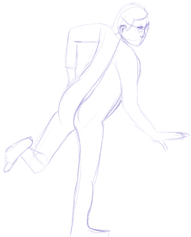
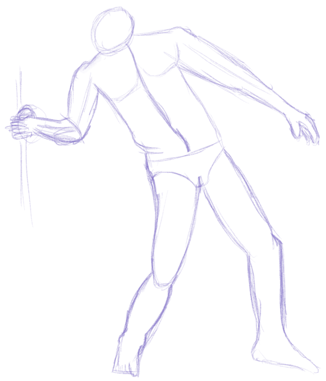
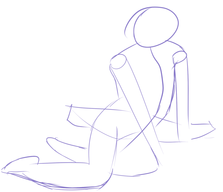
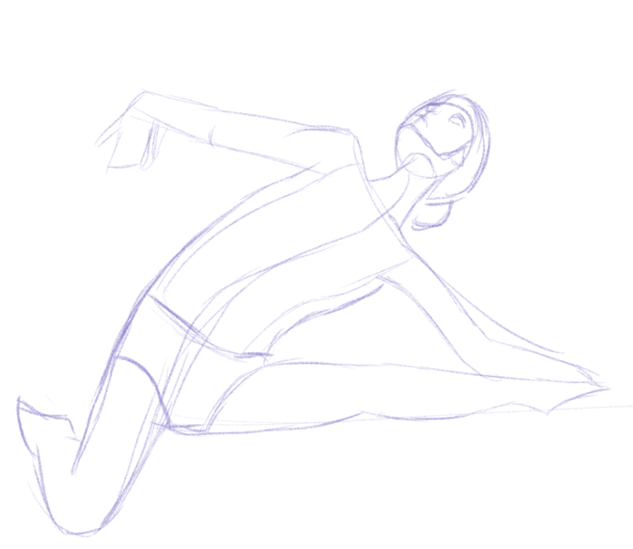
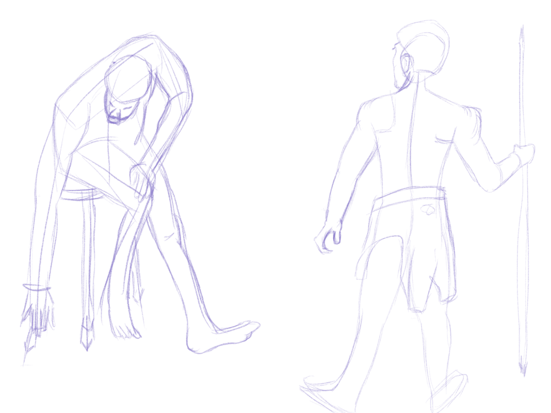
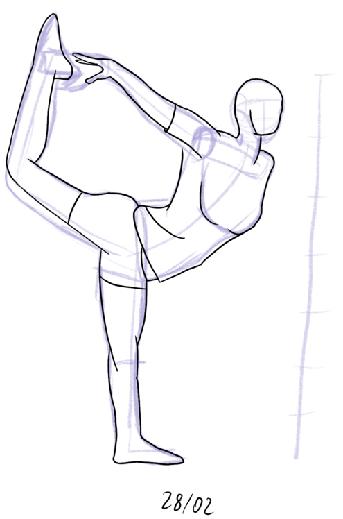
A popular exercise when learning to draw people is the timed drawing, where students draw a model in a short, predefined period of time. The goal is to be able to concentrate on capturing general gesture as opposed to details.
Many websites help to run a similar exercise online, where the student is drawing from a prepared picture which changes every couple of minutes.
I was using two websites for this: Line of Action and New Masters Academy channel on Youtube. They both have lots of content to draw.
You can see the effects of my experimentation below:
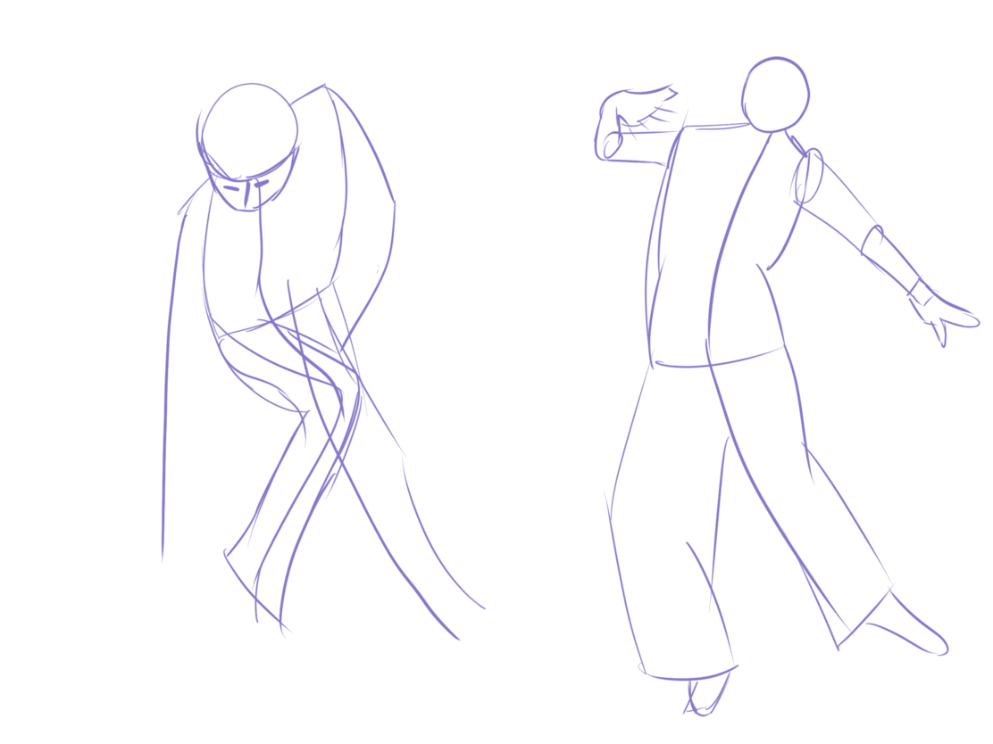
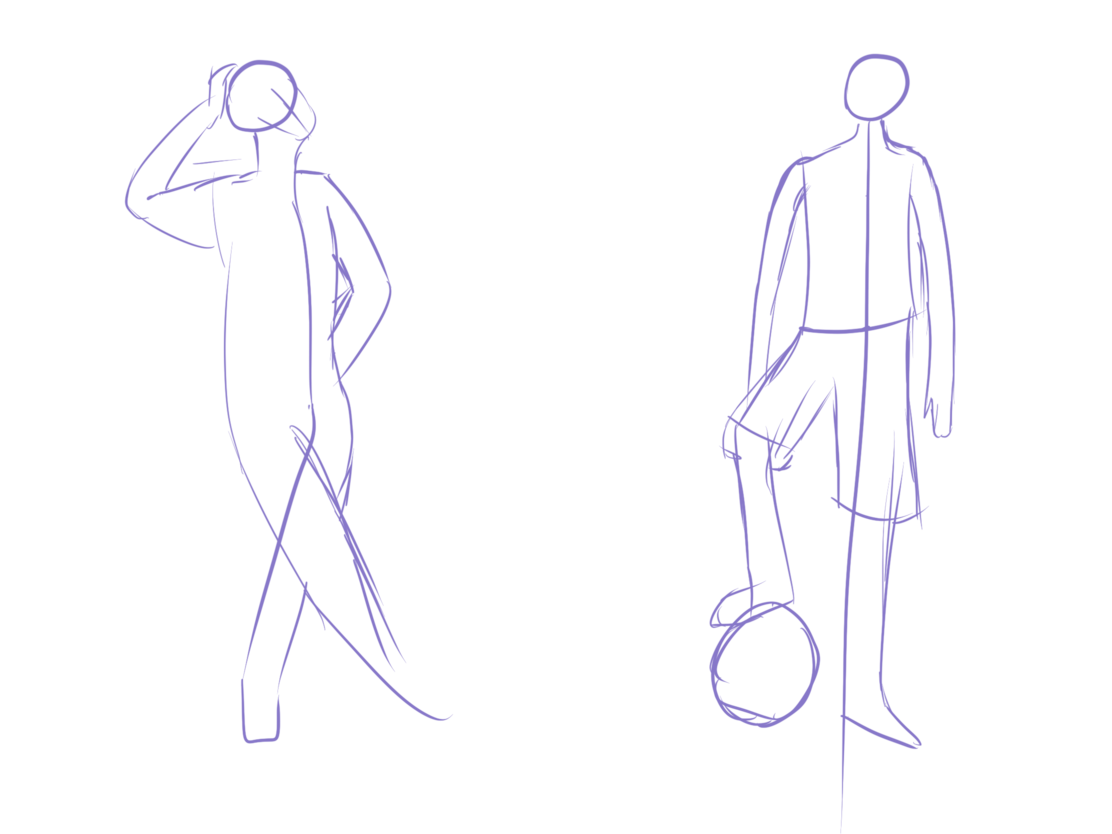
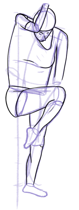
After doing these drawings, I have developed a workflow that seems to work well for me:
- I start with a quick gesture line
- Then, on another layer, I draw basic shapes on top to get all body parts in place.
- Finally, I draw a contour line with a slightly smoothing pen on the final layer.
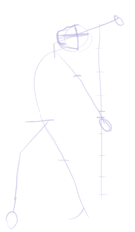
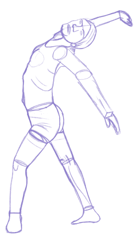
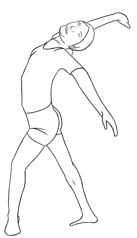
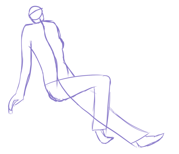
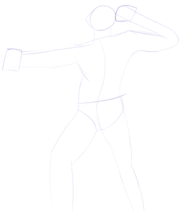
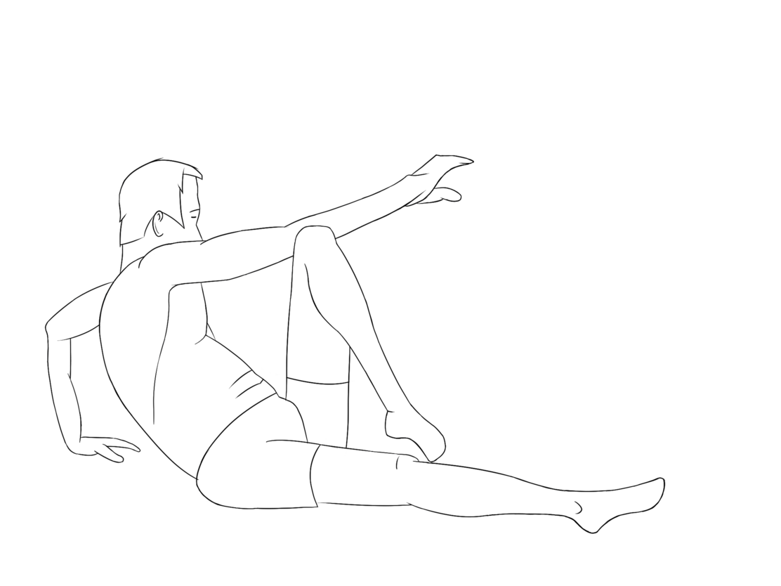
Before moving on to the next thing, I made a couple of drawings following the workflow below:
Portrait painting
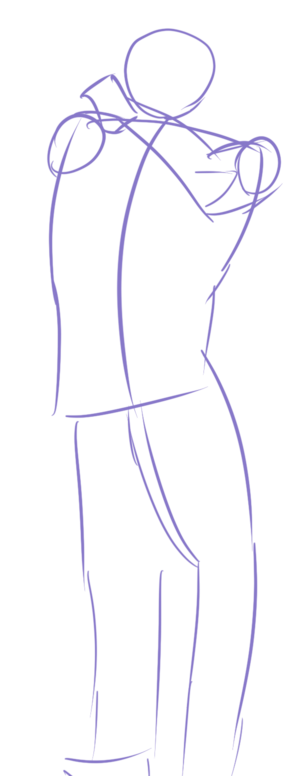
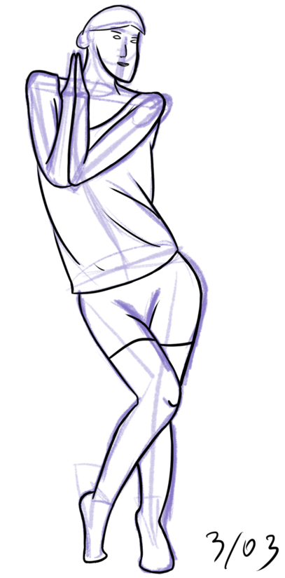
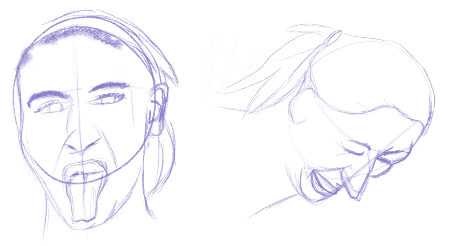
In the poses drawings, I omitted hands, feet, and faces, as they are harder than the overall shape of the body and a topic on their own. I decided to spend a bit of time learning to draw heads, though.
Initially, I did two sketches using the same reference page as before:
I then moved to digital painting. I started by following the walkthrough on a Sam Does Arts youtube channel:
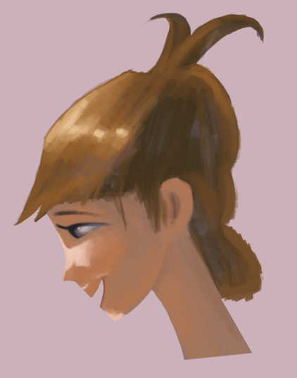
While not everything here looks great, I think the overall shapes and colors went fine.
Then, I tried to paint my girlfriend from a photo. To decrease the number of things to think about, I allowed myself to trace the picture to establish the initial shapes. Somehow, they still didn’t end up as well as they should, which created an opportunity to learn the liquify tool, which allows to smoothly shrink and stretch elements of the picture.
Another element that didn’t work well in this picture is the saturation of colors. While one would usually see less saturation in strongly-lit areas, as the skin has red stuff beneath it, you can see more vibrant colors in lighted areas than in neutral light (see subsurface scattering). The shadows also ended up too grey, looking too much like dirt.
Art studies
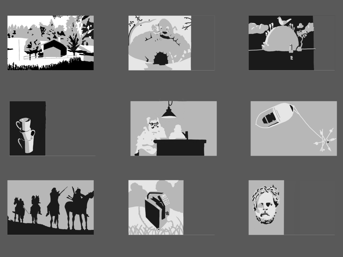
I found online a suggestion for improving one’s art: to analyze the paintings of others or movie frames. I decided to try two methods: a value and a color study.
Value studies
Value (lightness) is a primary tool for creating a contrast in a picture. To think about how others use values in their art, I followed an exercise to draw using only three colors: white, black, and grey. Initially, the areas that light reaches are covered with white, then the half-tone ones are getting changed to grey. Arguably, this exercise helps to understand the shape of the objects in the pictures.
Color studies
The other exercise I tried was a more holistic analysis of the pictures of others. I looked over a couple of them and tried to understand the techniques used and reproduce them in a simplified form.
I used pictures of AngryMikko and Marco Bucci for this, whose colors (despite having different styles) I enjoy.
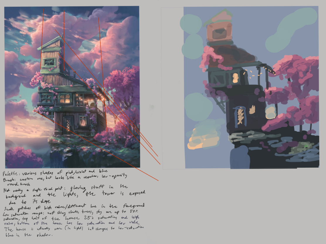
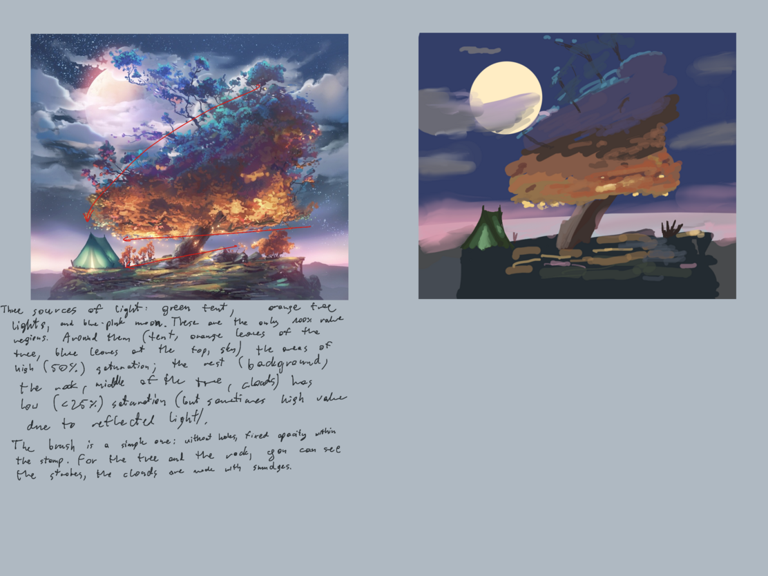
The main observation from Mikko was that, although his pictures feel colorful, he’s only using high saturation in a small portion of them: most of the time, he uses the saturation lower than 50%.
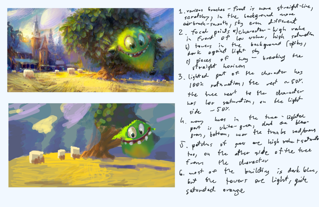
On the other hand, Marco uses more highly-saturated areas. He also uses a bunch of different brushes compared to Mikko. It seems that, as the character was the main focus, its high value/saturation looks good even though it should be more in shadow behind the tree.
Exercises
Apart from studying others’ work, I also did a couple of custom exercises.
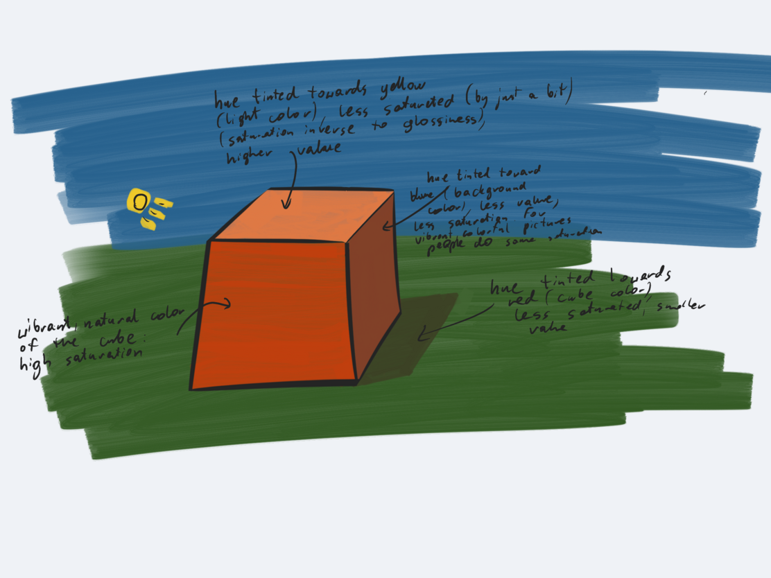
Lightning a cube
First, after watching a couple of tutorials about color theory (Light and shadow, Understanding shadow colors, Cavemen color theory), I decided to summarize the general ideas behind natural colors of areas in light and shadow.
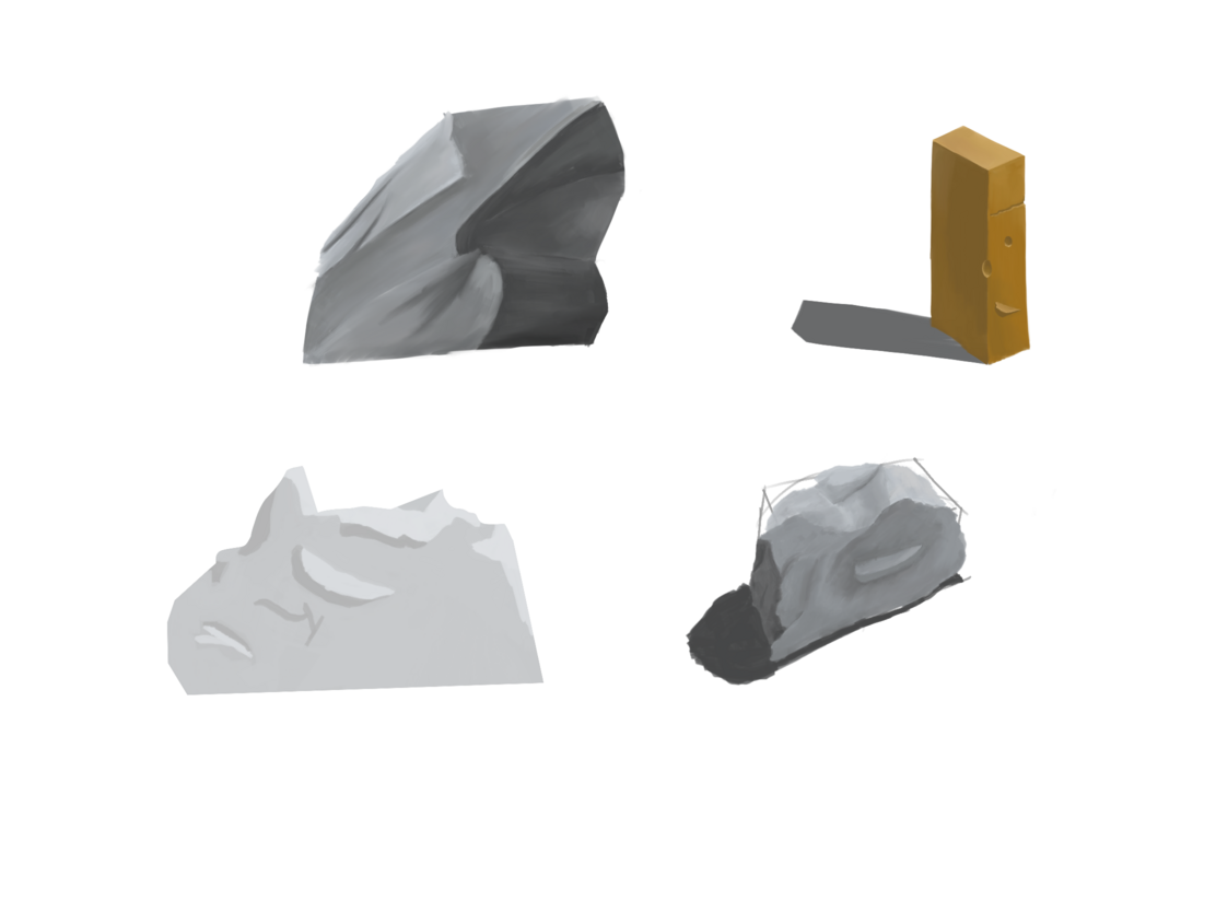
Rocks
Then, I decided to put it into practice a bit more and tried drawing rocks. I partially followed the tutorials (1, 2, 3), and partially tried to imagine the shapes on my own and confirm my understanding of lightning on a rock.
Glowing stuff
Then, I tried to learn how to draw glowing things, as I find them to look cool. I decided to draw a picture of a turtle in a dark forest with some symbols glowing on its shell.
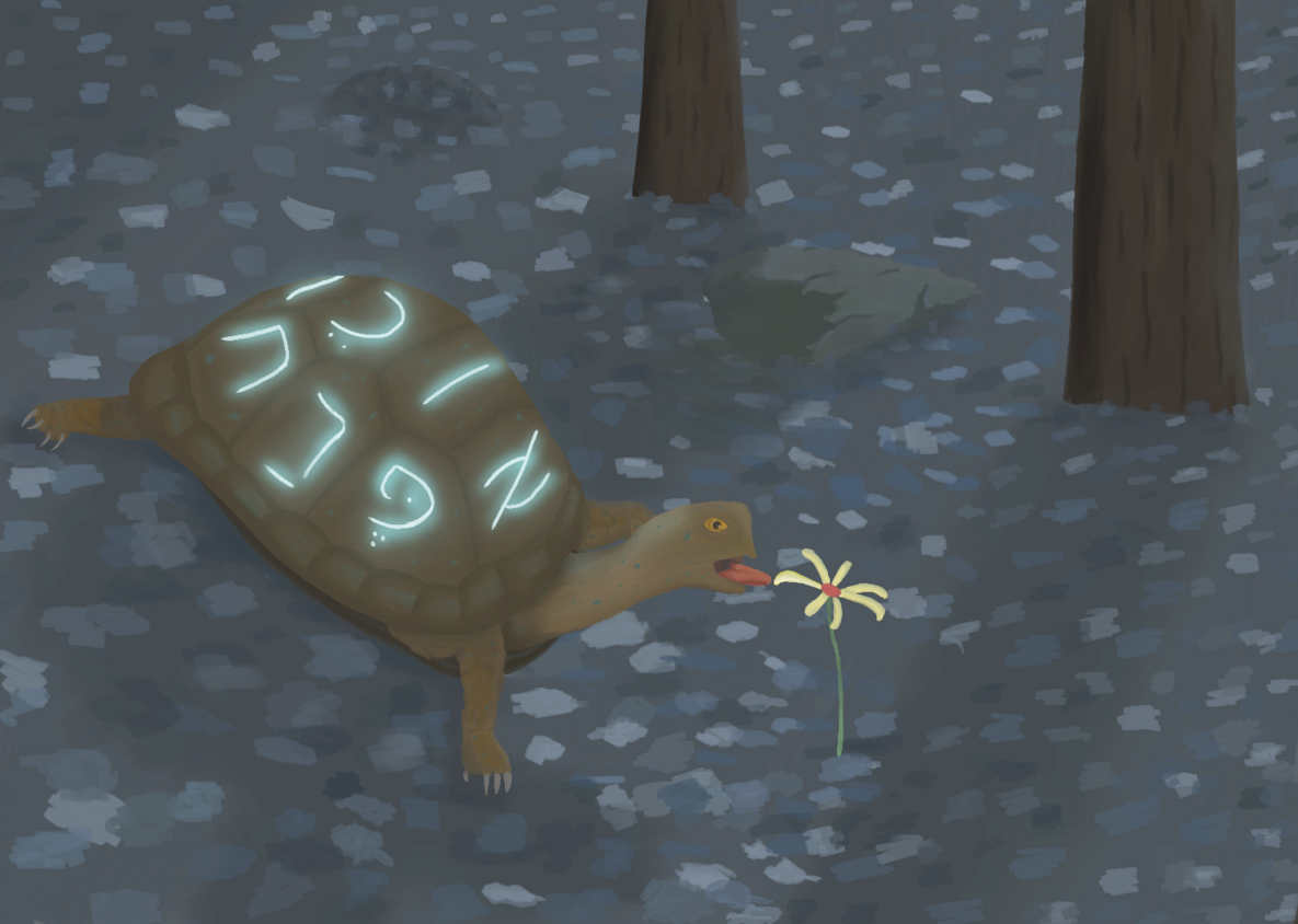
It turned out that the glowing letters were surprisingly simple to do; for this, I followed the advice of using multiple layers with more and more blurred images.
However, the overall image turned out so-so. I think these were the main problems:
I didn’t plan the composition/focal point/values upfront. The initial idea was to have a bigger view with a horizon line and fancy lights, but I decided to cut the complexity and concentrate on the turtle.
Even with a reduced view, I think there is too much area on the picture where nothing happens. I should have tried to put more contrasting elements around.
Apart from this, it seems I took Mikko’s example too much to heart and used saturated colors too little. I tried to fix it in the post-process, which only helped to some extent.
Summary
I did a few exercises to improve my use of colors and ability to draw people. While I still envy colorful landscapes and would like to learn how to paint them, I think that I like more the style of strong lines and simple, close to flat colors (more drawing than painting).